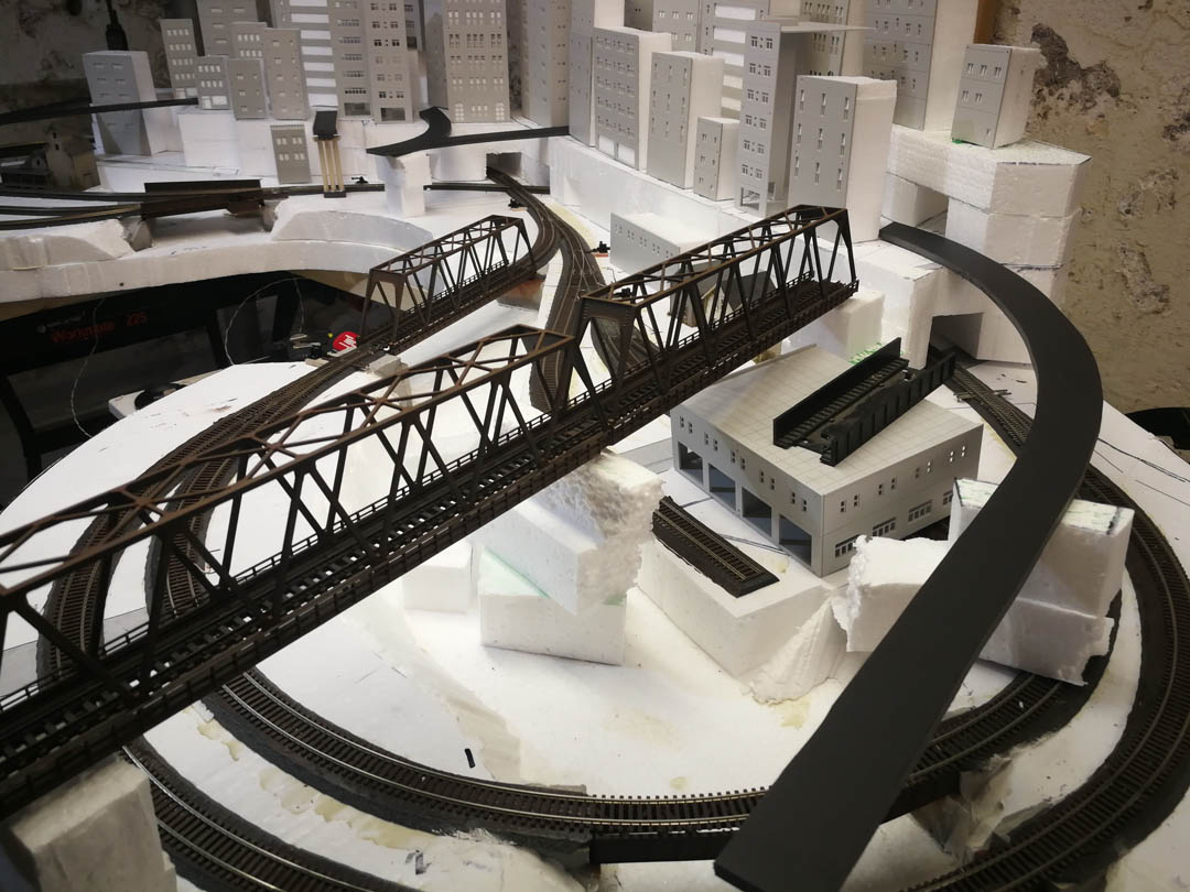
The placement of the urban structures has been completed. I may tweak small details, but the city’s design and visual arrangement are final. My overall goal is to convey a bustling forgotten metropolis long since consumed by nature and vagabond technologies. To add plausibility to the structure placement and chaotic aesthetic, I’m adding a series of highways and overpasses to frame the layout’s design, focus the observer’s eye towards the center of the urban downtown, and layer another visual element and give the scene more visual texture.
I decided that all of the roads could run in behind the frontmost facade of buildings – this should further suggest the city’s chaotic nature and reinforce the viewer’s perspective that they are behind the city – the seedy underbelly.
I designed the concrete overpasses to be somewhat prototypical but with a heavy dose of artistic license. Scaled two-lane highways with proper lane widths and shoulders were too broad and too distracting. The layout structures are generally no more than 6 to 12 stories high, and a true bustling metropolis would have buildings that would exceed 30 or 40 levels. While these buildings are large relative to houses, I want to give them as much presence as possible despite their slightly diminished size. Having full-size overpasses made the structures look smaller rather than larger, so I scaled down the roadways’ widths such that they are two car lanes wide with no shoulders or curves. Visually they suit the scale of the city far better and help make the buildings look larger.
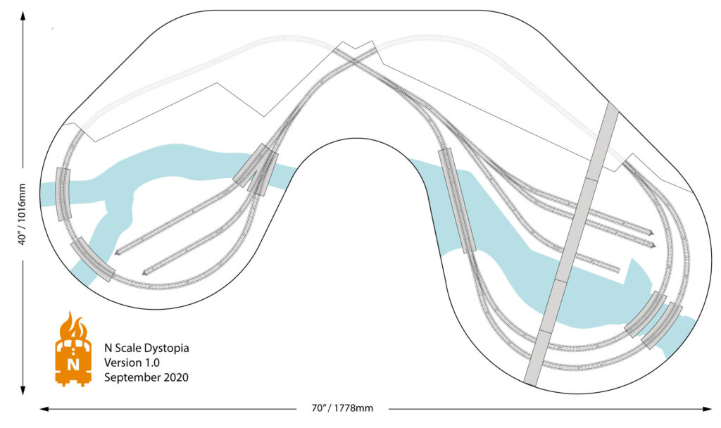
The roads’ arrangement is relatively straightforward – traffic can enter from either the left or right side and sweeps back to the viewer. The central lanes merge above the railway crossover that disappears under the city.


